→
Menu
→
Menu
←
←
My works
My works
WAIE - Fueling system
In development
Project
2/6
Redesign
Service
WAIE serves as an electronic refueling system designed to facilitate vehicle refueling management for both businesses and individuals. Utilizing remote sensing technology on fuel pumps, it seamlessly identifies the customer's vehicle by means of a smart chip (tag) installed near the vehicle tank.
Aldress Petroleum & Transport Services Company, a Saudi joint stock company boasting 500 gas stations and a fleet of 2500+ top-notch trucks and trailers across the Kingdom of Saudi Arabia and GCC countries, powers WAIE.
Visit website
→
Visit website
→
Visit website
→
Visit website
→
Team
Loonar studios
Team
Loonar studios
responsibilities
Research
Wireframing
ux/ui design
Design system
Prototyping
responsibilities
Research
Wireframing
ux/ui design
Design system
Prototyping
In numbers
425 hours
160 screens
3 prototypes
In numbers
425 hours
160 screens
3 prototypes

WAIE serves as an electronic refueling system designed to facilitate vehicle refueling management for both businesses and individuals.
→ Problems
WAIE was initially created for the corporate sector, serving companies with a large fleet of vehicles. However, the system lacked essential features that would meet their needs and expectations. As the time came to involve private users, clients faced the need to expand the functionality.
In addition to the lack of functionality, during the research stage, we identified drawbacks causing disappointment and reduced user engagement in the existing user experience:
Clients had to go through too many steps and actions to perform basic tasks in the system.
The system had a significantly delayed response time to user actions (backend developers were provided with recommendations on critical delays and the importance of reducing them where possible).
High cognitive load on the average user. While this might cause discomfort for corporate clients' employees, it won't work with private clients, and over time, it will lead to user attrition.
→ My role
Throughout the project, my responsibilities encompassed all stages: from initial research in collaboration with the lead designer and project manager to prototyping and the creation of the UI kit. The design process involved numerous discussions, consultations with business representatives, and team brainstorming sessions.
Throughout the project, my responsibilities encompassed all stages: from initial research in collaboration with the lead designer and project manager to prototyping and the creation of the UI kit. The design process involved numerous discussions, consultations with business representatives, and team brainstorming sessions.
Define and Research
→ discovery
Collecting requirements and restrictions was the initial stage of the project. This stage spent two days of discussion. It was close cooperation with the product owner and project manager and we polished some points that weren't too clean for understanding.
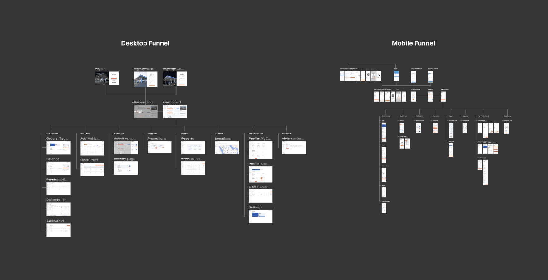
Note: The diagram shows final ux flow for the project for desktop and mobile. It was initially developed in a simplier way with simple schemas, but for demo with client it had to be updated with UI screens.
Collecting requirements and restrictions was the initial stage of the project. This stage spent two days of discussion. It was close cooperation with the product owner and project manager and we polished some points that weren't too clean for understanding.
Note: The diagram shows final ux flow for the project for desktop and mobile. It was initially developed in a simplier way with simple schemas, but for demo with client it had to be updated with UI screens.
→ clarification
Overall I took around 2 weeks for additional calls with clients and team brainstorming sessions we defined some secondary requirements and restrictions. We've found that clients have additional rules and regulations for corporate customers, that can affect system behavior and some technical details. Then started to claim goals we needed to earn during the project.
Overall I took around 2 weeks for additional calls with clients and team brainstorming sessions we defined some secondary requirements and restrictions. We've found that clients have additional rules and regulations for corporate customers, that can affect system behavior and some technical details. Then started to claim goals we needed to earn during the project.
→ project goals
Information clarity: This partially followed from the previous one. Focus on the design of the information panel, giving priority to visual clarity to ensure users have a clear understanding of crucial system events.
Scalability: Enhance adaptability for various fleet sizes, ensuring a seamless experience for users managing multiple corporate vehicles.
Intuitive navigation: Prioritize navigation clarity, allowing users to easily locate essential functions and interact with them without cognitive overload.
Automation: reduce manual steps and enhance efficiency for both corporate employees and private users.
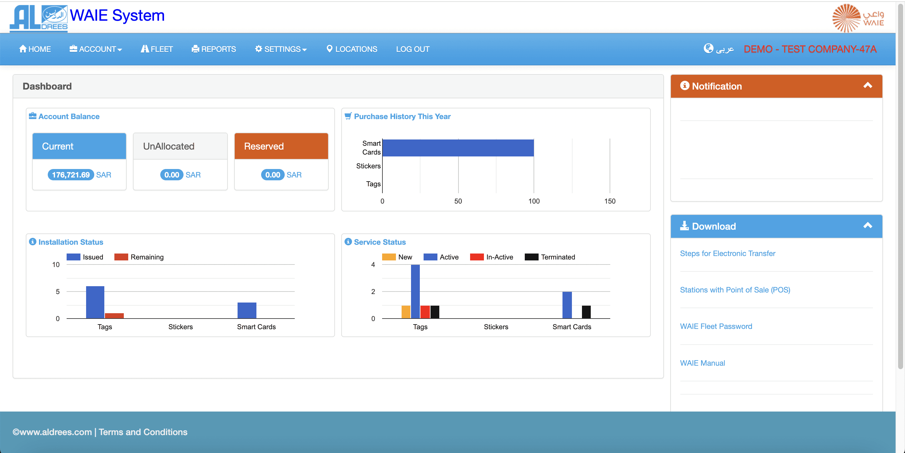
New design system: The current style looks extremely outdated. It has to be redrawed from scratch. We kept the main colors from the main company style and expanded it with new clean and accessible colors that pass WCAG standards.
Information clarity: This partially followed from the previous one. Focus on the design of the information panel, giving priority to visual clarity to ensure users have a clear understanding of crucial system events.
Scalability: Enhance adaptability for various fleet sizes, ensuring a seamless experience for users managing multiple corporate vehicles.
Intuitive navigation: Prioritize navigation clarity, allowing users to easily locate essential functions and interact with them without cognitive overload.
Automation: reduce manual steps and enhance efficiency for both corporate employees and private users.
New design system: The current style looks extremely outdated. It has to be redrawed from scratch. We kept the main colors from the main company style and expanded it with new clean and accessible colors that pass WCAG standards.
Solutions
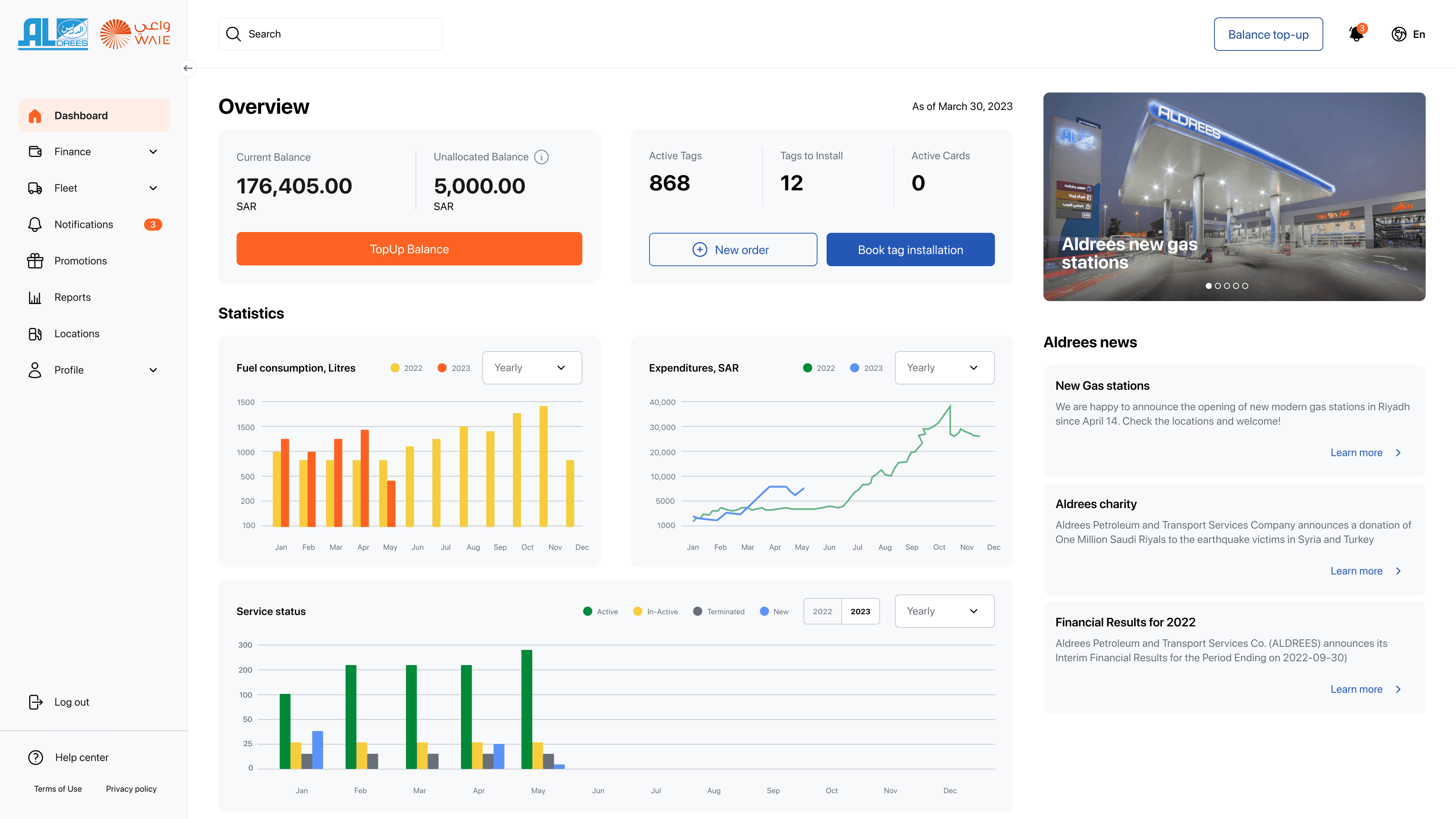
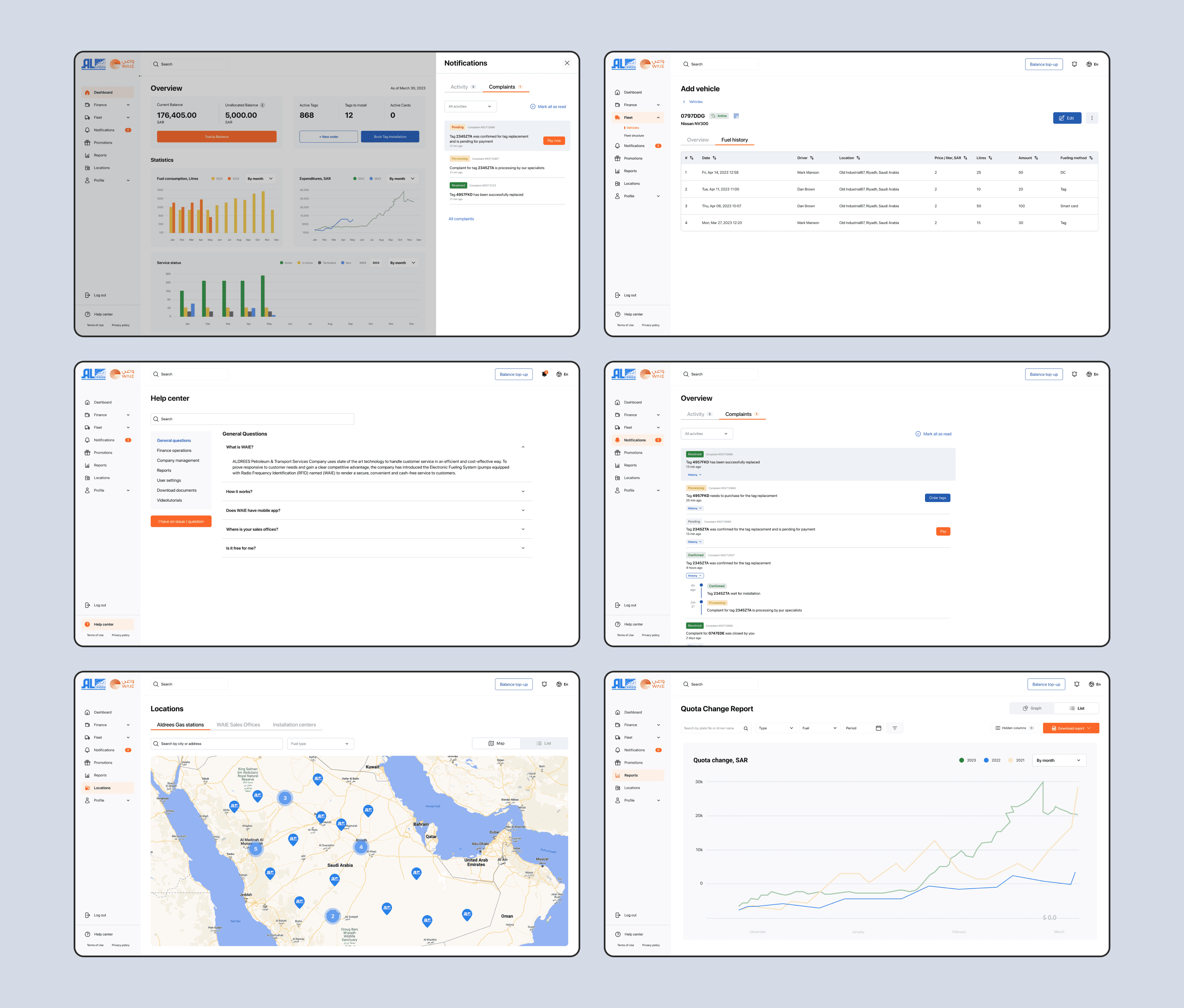
→ new dashboard
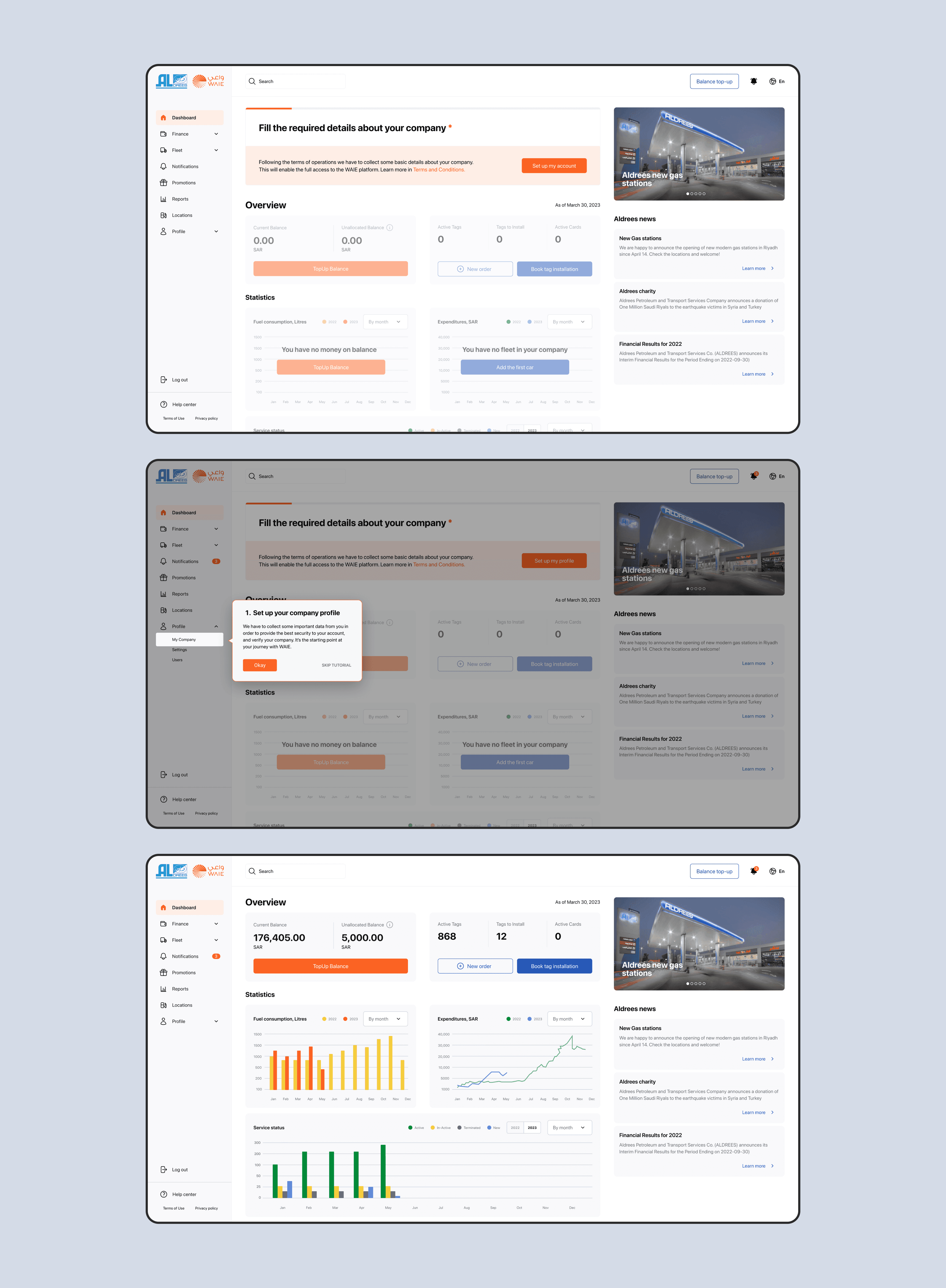
One of the main tasks was to create a convenient dashboard from which the user could access essential information without navigating through different sections. In addition, during the interface development process, onboarding for new users was implemented, helping them input the information to work with the system. Of course, this onboarding could be turned off if needed.
One of the main tasks was to create a convenient dashboard from which the user could access essential information without navigating through different sections. In addition, during the interface development process, onboarding for new users was implemented, helping them input the information to work with the system. Of course, this onboarding could be turned off if needed.
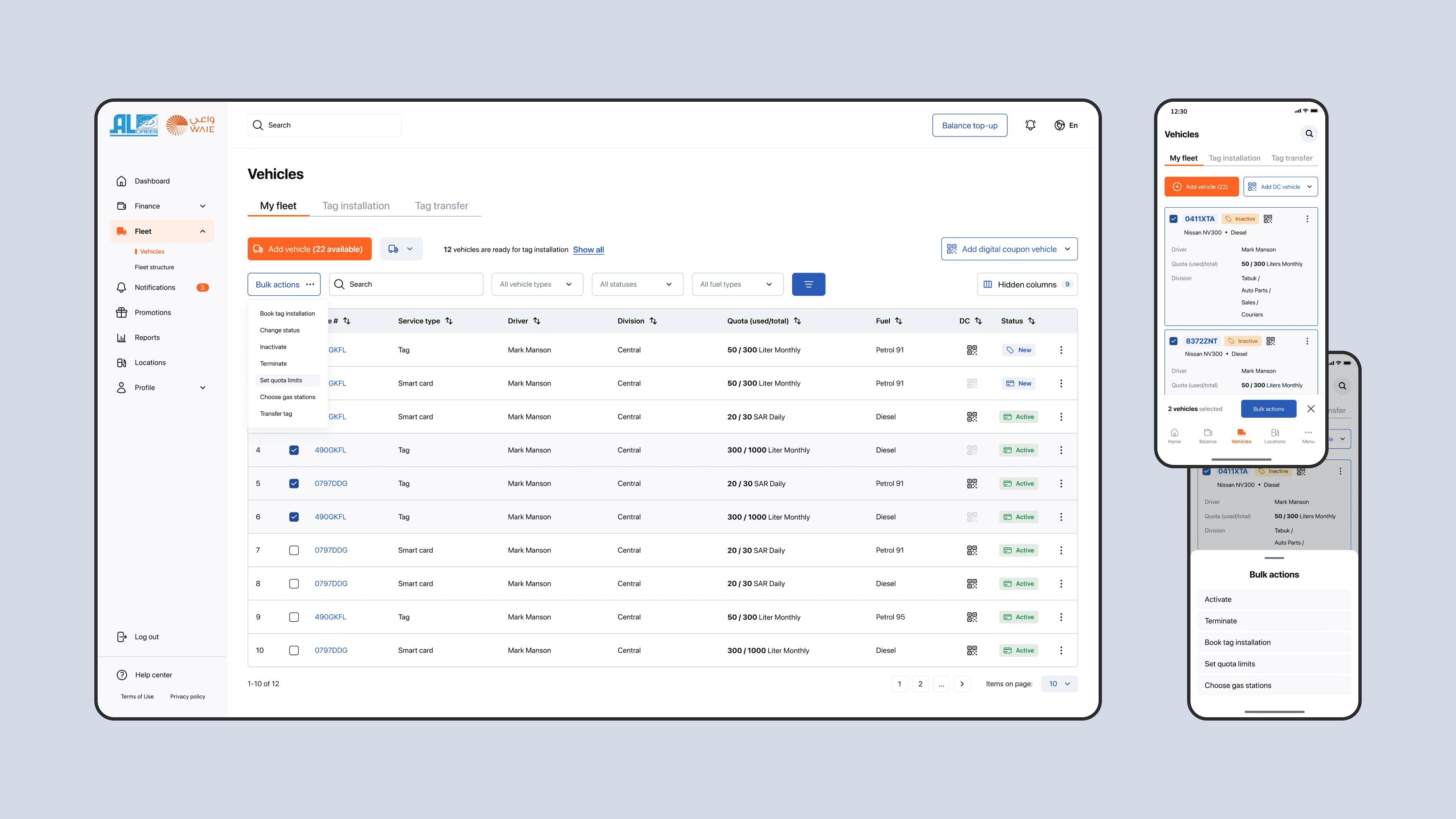
→ scalability
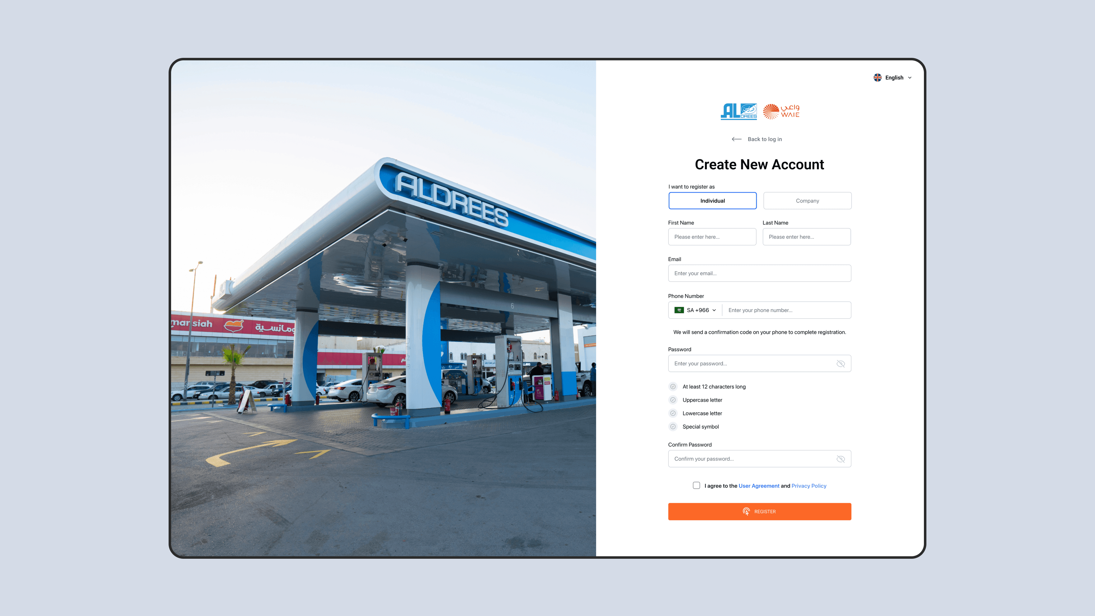
A crucial requirement for the new interface was its scalability based on the user type and fleet size. The system needed to ensure ease of management for both 1-2 cars and a fleet ranging from dozens to hundreds of vehicles. Firstly, a separate user type was added for individual users. This feature was not presented in the system before as I previously mentioned due to orientation towards the corporate segment.
A crucial requirement for the new interface was its scalability based on the user type and fleet size. The system needed to ensure ease of management for both 1-2 cars and a fleet ranging from dozens to hundreds of vehicles. Firstly, a separate user type was added for individual users. This feature was not presented in the system before as I previously mentioned due to orientation towards the corporate segment.
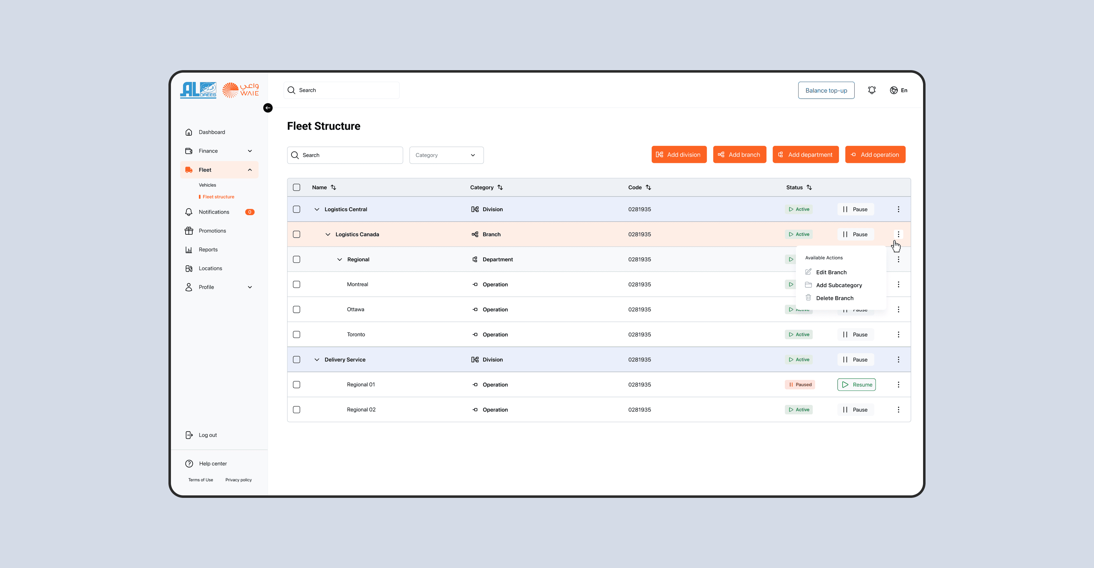
→ improved fleet management
The client can choose the type of services according to requirements: both the development of a unique system and a salesforce-based solution. Depending on the needs, the client can choose one of the available options:
The client can choose the type of services according to requirements: both the development of a unique system and a salesforce-based solution. Depending on the needs, the client can choose one of the available options:
→ digitalized tag installation process
Previously, the installation of tags on vehicles occurred manually, requiring customers to call the company's call center and arrange for tag installation at a station.
Now, there is the option to remotely schedule, track, and manage the timelines for tag installation on vehicles in the fleet.
Previously, the installation of tags on vehicles occurred manually, requiring customers to call the company's call center and arrange for tag installation at a station.
Now, there is the option to remotely schedule, track, and manage the timelines for tag installation on vehicles in the fleet.
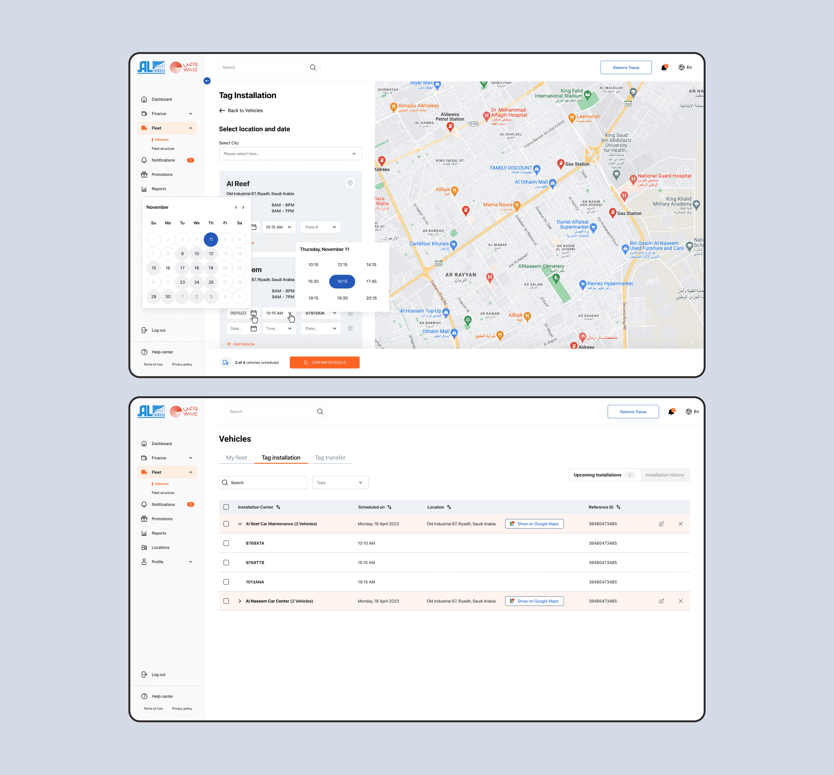
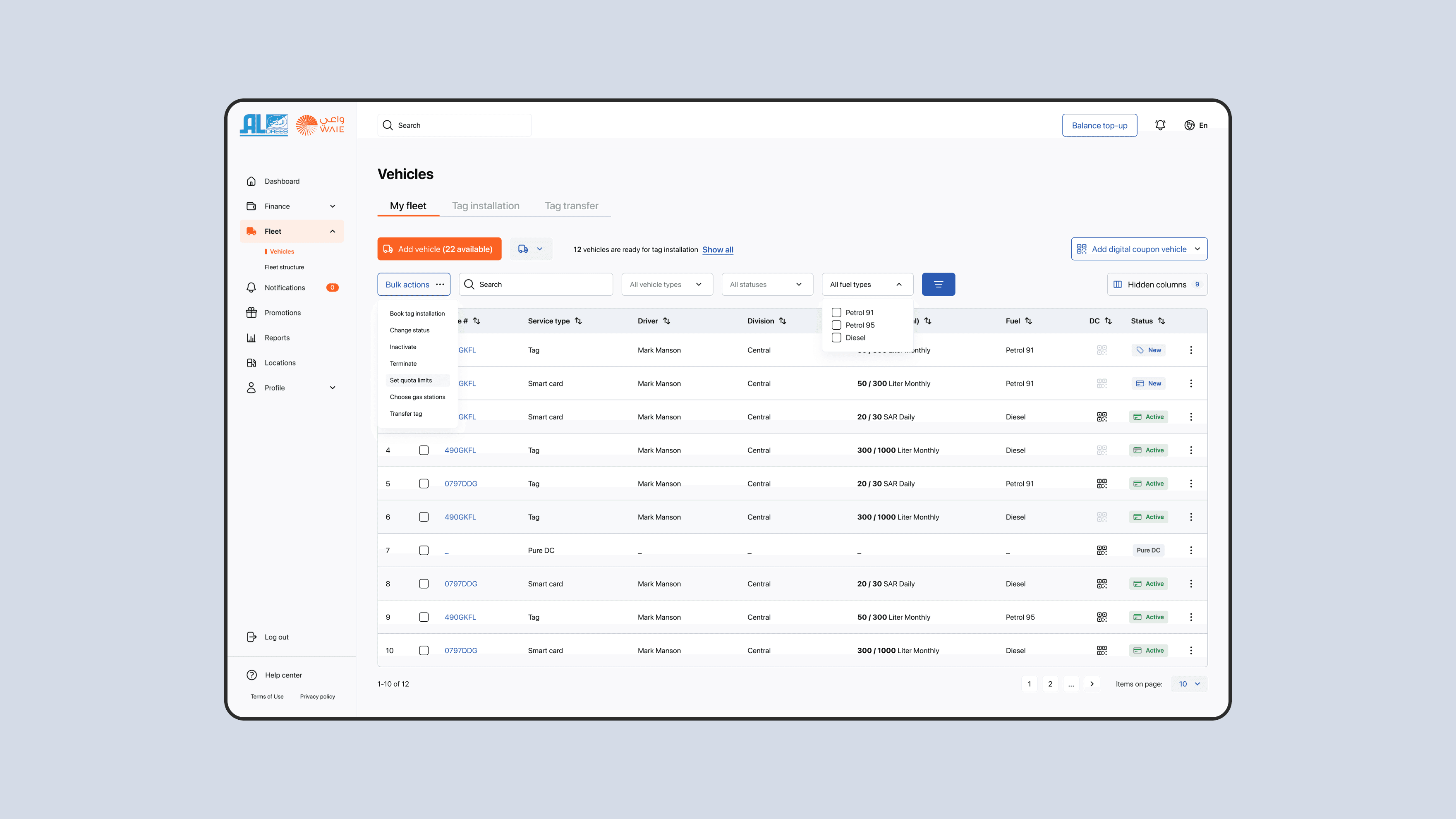
→ mass actions
When project comes to us it`s defined as one of the largest problem. Company with large fleet can't manage a bulk of cars and make changes to some groups, categories and types. Multiple vehicles actions were added both to desktop and mobile versions, but they works in a bit different ways due to screen sizes and resolutions.
When project comes to us it`s defined as one of the largest problem. Company with large fleet can't manage a bulk of cars and make changes to some groups, categories and types. Multiple vehicles actions were added both to desktop and mobile versions, but they works in a bit different ways due to screen sizes and resolutions.
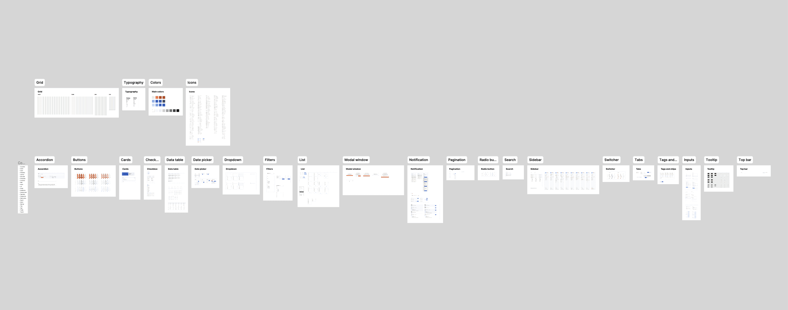
→ new look and design library
And the last mentioned part but the same important as previos topics was The updated design also required new design assets and a review of the approach to creating the control elements set. Therefore, just before crafting the UI interface layouts, I worked on creating it. The project didn't allocate resources for designing a full-fledged design system, so it was decided to stop at a limited UI kit. This decision brought the following advantages:
More flexible change management in design elements through a component-based approach.
Acceleration of UI interface assembly since most elements were implemented as components. The process itself transformed into screen assembly using the design library. According to estimates, this saved 30% of the time allocated for the current stage.
Easier changes management and design improvement for future updates. It helps to reduce resources for the next design iterations.
→ polishing interaction experience
Few screens with the updated UI showed below. Some of flows were reworked from scratch while other requires only minor changes with UI updates.
Few screens with the updated UI showed below. Some of flows were reworked from scratch while other requires only minor changes with UI updates.
conclutions
The objective is to streamline access to the contactless gas service, making it as seamless as receiving complimentary food samples in a store. Users should easily grasp the value with just a few clicks and minimal physical interaction. Achieving this goal may entail exploring alternative methods for tag installation.

